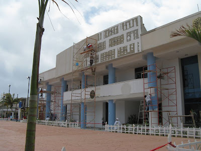
Another waste of taxpayer's money has recently taken place on the island. Somebody in their infinite wisdom decided to spend money on giving this building a new face.
IMHO, that money could have been better spent on infrastructure improvements or school programs. But once again, nobody asked me my opinion. So on with the renovation.
The first thing they did was tear off the top with it's curving lines. The only point of interest on this building. Then they built the rim wall up a bit, built a wooden frame and covered it with wallboard. Oh, that will sure withstand the hurricane force winds that will hit us again some day.
They also extended the dignitaries balcony across the whole entrance. This will allow the Mayor to be surrounded by more of her friends and families, oops, I mean staff, during official events.
Here we go, all completed. That stage in front is only temporary. We just had the Mayor's State of the Island address last week.
Ok, I admit, it doesn't look that bad. My point though is that there was nothing wrong with the old facade and the money could have been put to better use.
I did watch this guy paint the pillars one day. It was really interesting. He used a putty knife instead of a brush. He spread the paint back and forth instead of up and down.
The results are really beautiful. The color is concentrated at the bottom and graduates up. The whole thing looks like Venetian Plaster. Very nice job.
While I was on the Plaza, I grabbed a quick shot of those palm trees that were put in a while ago. Look how well they are doing. Or not.
Here's a close-up. Look how dead and brown the fronds are. Thankfully the growing head is doing fine and these trees should do fine. Despite the neglect.


8 comments:
Ugh ugh ugh. It just gets ugh-lier! But I'm LMAO at the Venetian plaster/paint job!
I like the blue pillars, but am not crazy about the white picket fence. Is that permanent?
That painting technique is great ..... wonder how I can use it here???
O Robert
I'm beginning to think you have waaay too much time on your hands! Ha........
I think the "paint" used is cal which lasts a lot longer.....they use it in the historical area of San Miguel on the buildings. It is fascinating to watch the application.
LAB: the venetian plaster look is really quite pretty in person. it glistens.
isladeb: well thanks alot! You just spoiled one of my upcoming posts on the fences! (just kidding!) unfortunately, they are permanent. They also line the meridian that runs the entire length in front of the navy base. looks like the freakin' suburbs!
o robert: where's here?
babs: seriously, why do you think I have too much time on my hands? (i do, but what would make you say that?)
Wayne, right after I commented on the plaster finish,I knew I'd missed the beauty in it. But that white paint is way too stark! I'm wondering if they're not watering those palms enough. Huge transplanted palms like that would take a LOT of water. They probably never made it through the shock of being transplanted at that size. I see the same thing around here when big developers line properties with those. A certain number of them end up dying.
Amigo -- If you think the façade change was a waste, you should see some of the projects that are being blessed with "stimulus" money in our state.
The white picket fence is just wrong!
Post a Comment